

Histograms display the distribution of continuous data, with bars representing ranges of values. Bar graphs show discrete data comparisons with separate bars for each category.
TL;DR Histogram And Bar Graph
A histogram is a graphical representation of data that involves organizing continuous data into intervals or bins and displaying the frequency or count of occurrences within each interval. It provides a visual representation of the distribution of data, depicting the shape, center, and spread of a dataset.
A bar graph is a chart that uses rectangular bars of equal width to represent data in different categories or groups. The length of each bar corresponds to the value it represents, making it suitable for displaying discrete or categorical data.
Understanding Histograms and Bar Graphs
Histograms and bar graphs are both visual representations of data, but they have some key differences:
Histogram:
- A histogram represents the distribution of continuous data by dividing it into intervals or bins.
- The x-axis of a histogram represents the range of values being measured, while the y-axis represents the frequency or count of data points within each interval.
- There are no gaps between the bars in a histogram since the data is continuous.
- Histograms are commonly used in statistics and data analysis to show the shape, center, and spread of a dataset.
- They are useful for analyzing large datasets and identifying patterns or outliers.
Bar Graph:
- A bar graph represents categorical or discrete data by using rectangular bars.
- Each bar in a bar graph represents a specific category or group, and the length of the bar corresponds to the frequency, count, or proportion of that category.
- There are gaps between the bars in a bar graph since the data is discrete.
- Bar graphs are commonly used to compare data across different categories or groups.
- They are useful for displaying data that is not continuous and for making comparisons or identifying trends between different categories.
Understanding the differences between histograms and bar graphs can help you choose the appropriate visualization method based on the type of data you are working with and the insights you want to convey.
What is a Histogram?
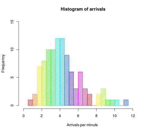
A histogram is a graphical representation of data that displays the distribution of a continuous variable. It consists of a series of adjacent rectangles or bars, where the area of each bar represents the frequency or count of data within a specific range or bin.
Key features of a histogram:
- Continuous Data: Histograms are used to represent continuous data, which is data that can take on any value within a range. Examples of continuous variables include height, weight, temperature, and time.
- Data Distribution: Histograms provide a visual representation of how data is distributed across different intervals or bins. The width of each bar represents the range of values for a particular bin, while the height represents the frequency or count of data within that bin.
- No Gaps: In a histogram, the bars are adjacent to each other, with no gaps between them. This signifies that the data is continuous, and there are no missing values within the specified range.
- Axes: Histograms have two axes: the x-axis and the y-axis. The x-axis represents the range of values or intervals, while the y-axis represents the frequency or count of data within each interval.
- Normalization: The height of each bar in a histogram can be normalized to represent the relative frequency or probability density of the data. This allows for comparison of distributions with different sample sizes or bin widths.
How is a Histogram Constructed?
To construct a histogram, follow these steps on how is a histogram constructed:
- Determine the range of values: Identify the range of values that will be represented in the histogram. For example, if you are analyzing test scores, the range could be 0-100.
- Divide the range into intervals: Divide the range into equal intervals called bins. The number of bins will depend on the data and the desired level of detail. For example, you could have bins of 10, so the intervals would be 0-10, 10-20, 20-30, and so on.
- Count the frequency: Count the number of data points that fall within each interval. This represents the frequency of values in that range.
- Plot the bars: On a graph, plot the intervals on the x-axis and the frequency on the y-axis. Each bar should represent an interval, and the height of the bar should correspond to the frequency.
- Add labels and titles: Label the x-axis with the interval ranges and the y-axis with the frequency. Add a title to the histogram to describe the data being represented.
By following these steps, you can effectively construct a histogram to visualize the distribution of your data. For example, in a true story, a researcher used a histogram to analyze the distribution of customer ages in a retail store. By constructing the histogram, they were able to identify the age groups that frequented the store the most and tailor their marketing strategies accordingly. This helped boost sales and improve customer satisfaction.
When is a Histogram Used?
A histogram is used to represent the distribution of continuous data and to show the frequency or count of data within specific intervals or bins. It is commonly used to visualize data that has a large range and to identify patterns or trends within the data.
One instance when a histogram is used is in analyzing the height distribution of a population. By dividing the height values into intervals or bins, a histogram can reveal the frequency of individuals within each height range. This allows researchers to identify the most common height range and any outliers or unusual patterns in the data.
Another usage of histograms is in analyzing test scores. For example, a histogram can be used to display the distribution of test scores for a class, showing the frequency of scores falling within different ranges. This helps in identifying the overall performance of the class and any patterns in the distribution of scores.
Histograms are also used in data analysis and research to identify the shape of a distribution, such as whether it is symmetric, skewed, or bimodal. This information provides insights into the underlying characteristics of the data and can guide further analysis.
A histogram is a useful tool for visualizing and analyzing continuous data, providing a clear representation of the distribution and allowing for easy interpretation of the frequency or count of data within specific intervals or bins.
What is a Bar Graph?
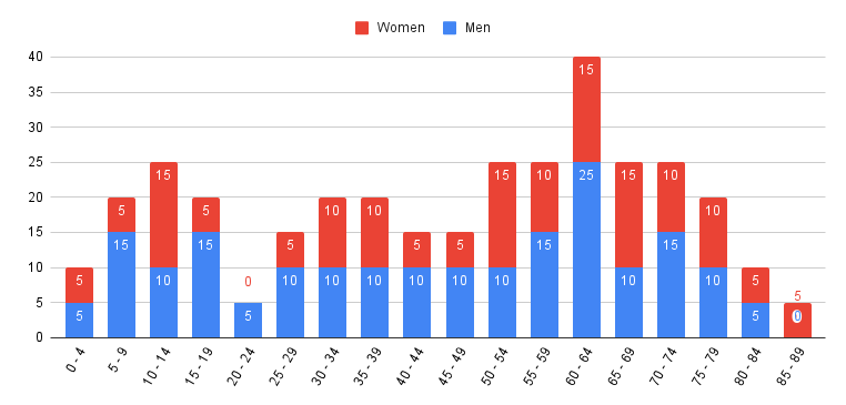
A bar graph is a visual representation of categorical data using rectangular bars. It is a common method for displaying and comparing different categories or groups of data. The following are key characteristics of a bar graph:
- Representation: In a bar graph, each category or group is represented by a separate bar. The length or height of the bar corresponds to the quantity or value being represented.
- Axes: A bar graph has two axes: the vertical axis (y-axis) represents the measured values or frequencies, while the horizontal axis (x-axis) represents the categories or groups.
- Categories: The categories or groups being compared are usually distinct and non-overlapping. They can be anything from different time periods, geographic locations, or various items.
- Spacing: The bars in a bar graph are typically spaced apart, allowing for easy comparison between categories.
- Color or Patterns: Different colors or patterns can be used to differentiate the bars and make the graph visually appealing.
- Labels and Titles: Bar graphs include labels for the categories on the x-axis and a title that describes the overall purpose of the graph.
- Uses: Bar graphs are commonly used to compare and display data across different categories or groups. They are effective in visually representing data that can be easily understood and interpreted by a wide range of audiences.
A bar graph is a useful tool for presenting categorical data in a clear and straightforward manner, allowing for easy comparison and analysis.
How is a Bar Graph Constructed?
To construct a bar graph, follow these steps:
- Determine the variables: How is a Bar Graph Constructed? Identify the variables you want to represent on the graph, such as categories or groups.
- Choose a scale: Determine the range and intervals for each variable. The scale should be appropriate for the data being represented.
- Label the axes: Write the labels for both the x-axis (horizontal) and y-axis (vertical) based on the variables being represented.
- Draw the axes: Draw the horizontal x-axis and vertical y-axis on a graph paper or software. Make sure they intersect at the zero point.
- Plot the bars: For each variable, draw rectangular bars above the appropriate category on the x-axis. The height of each bar represents the value or frequency of that variable.
- Color or shade the bars: Use different colors or shading techniques to differentiate between different variables or categories.
- Add a title: Write a clear and descriptive title for the bar graph that summarizes the data being represented.
Pro-tip: When constructing a bar graph, it’s important to ensure the width of each bar is consistent and does not overlap with other bars. This allows for accurate visual comparison of the variables being represented.
When is a Bar Graph Used?
A bar graph is used when you want to visually represent categorical data and compare different categories or groups. It is typically used to show discrete, non-continuous data and is especially effective for displaying data that can be easily understood at a glance.
Here is a table demonstrating when a bar graph is used:
| Scenario | Example |
| Comparing data between different cities | Number of tourists in New York, Los Angeles, and Chicago |
| Showing preferences or opinions | Favorite colors: red, blue, green |
| Displaying sales data for different products | Number of units sold for Product A, Product B, and Product C |
| Presenting survey results | Percentage of people who prefer tea, coffee, and juice |
Key Differences Between Histogram and Bar Graph
When it comes to visualizing data, understanding the key differences between histograms and bar graphs is crucial. In this section, we’ll uncover the basic distinctions, including the types of data each represents and their relationship with frequency. We’ll also explore how to interpret and analyze these graphical representations effectively. So, buckle up as we dive into the fascinating realm of data representation, types, frequency, and interpretation!
Data Representation
Data representation is an essential aspect of both histograms and bar graphs. It involves visually organizing and presenting data in a meaningful way. To compare these two types of graphs, we can create a table to illustrate the differences in data representation.
| Histogram | Bar Graph | |
|---|---|---|
| Definition | A graphical representation of a frequency distribution | A graphical representation of categorical or discrete data |
| X-axis | Represents the range of values or categories being analyzed | Represents the categories or groups being compared |
| Y-axis | Represents the frequency or count of occurrences for each interval | Represents the numerical value associated with each category |
| Bar Shape | Rectangles with no gaps between the bars | Rectangles with gaps between the bars |
| Data Type | Typically used for continuous data | Typically used for categorical or discrete data |
| Frequency Analysis | Used to analyze the distribution and patterns of a continuous dataset | Used to compare different categories or groups |
An interesting fact about data representation is that it plays a crucial role in analysis and interpretation. By visually organizing data, it becomes easier to identify trends, patterns, and relationships within the dataset. Both histograms and bar graphs offer effective ways to visually represent data, allowing for better understanding and insights.
Data Types
The data types used in histograms and bar graphs can vary based on the nature of the data being represented. Below is a table highlighting the different data types commonly used in both types of graphs:
| Data Types | Histogram | Bar Graph |
| Numerical | Used to represent continuous data, such as temperature or time intervals. | Used to represent discrete data, such as the number of students in different grade levels. |
| Categorical | Can be used when numerical data is grouped into categories, such as age groups or income brackets. | Commonly used to compare different categories, such as sales of different products or preferences among different colors. |
| Ordinal | Used when data has a natural order or rank, such as ratings from 1 to 5 or levels of satisfaction. | Can be used to represent data with a natural order, such as educational attainment levels or job positions. |
Understanding the appropriate data type for your graph is crucial as it determines the accuracy and effectiveness of the visual representation. By considering the nature of your data, whether it is numerical, categorical, or ordinal, you can choose between a histogram or a bar graph to effectively illustrate your data.
Use of Continuous and Discrete Data
When it comes to the use of continuous and discrete data, there are some key considerations to keep in mind. To better understand these considerations, let’s take a look at the following table:
| Continuous Data | Discrete Data |
|---|---|
| Measurements that can take on any value within a given range. | Data that can only take on specific, separate values. |
| Examples: temperature readings, time intervals, height of individuals. | Examples: number of students in a class, number of cars in a parking lot, dice rolls. |
| Generally represented on a histogram, which uses continuous bars to display the distribution of data. | Usually represented on a bar graph, which uses separate bars to compare and display different categories of data. |
| Requires grouping of data into intervals to create a frequency distribution. | Represents individual values or counts without the need for intervals. |
| Allows for the analysis of trends and patterns within a continuous range. | Allows for the comparison and analysis of distinct categories. |
When working with continuous data, a histogram provides a visual representation of the data’s distribution, allowing for in-depth analysis. On the other hand, for discrete data, a bar graph is often more suitable, as it allows for easy comparison and visualization of separate categories.
Relationship with Frequency
- A histogram displays the frequency distribution of continuous data, showing how often each value or range of values occurs.
- A bar graph, on the other hand, represents categorical data and displays the frequency or count of each category.
- In a histogram, the frequencies are represented by the heights of the bars. The higher the bar, the greater the frequency of values falling within that range.
- For a bar graph, the heights of the bars represent the frequency or count of each category. The length of the bars can vary, but they are usually of equal width.
- In a histogram, the width of the bars corresponds to the range of values being represented. Narrow bars indicate a smaller range, while wider bars represent a broader range of values.
- In the case of a bar graph, there is no specific width assigned to the bars as they represent distinct categories.
- The relationship with frequency is more pronounced in a histogram as the heights of the bars directly represent the frequency or count of values within each range.
- In a bar graph, the frequency or count is displayed at the top of each bar, but the actual height of the bar does not signify the exact frequency.
- When analyzing a histogram, the shape of the distribution and any peaks or gaps can provide insights into the underlying data.
- For a bar graph, the focus is on comparing the frequencies or counts of different categories and identifying any differences or patterns.
Interpretation and Analysis
When it comes to understanding histograms and bar graphs, interpretation and analysis play a crucial role. By carefully examining the data presented in these visual representations, valuable insights can be gained.
| Interpretation | Analysis |
|---|---|
| Interpreting a histogram involves analyzing the shape and distribution of the data. Through interpretation, one can identify the central tendency and dispersion of the data by observing the position and spread of the bars. For example, a histogram with a bell-shaped curve indicates a normal distribution. | Analyzing a histogram enables us to gain a deeper understanding of the underlying data. By performing analysis, we can study the frequencies and proportions of the different bins and identify patterns, outliers, and trends. This information allows us to make informed decisions and draw meaningful conclusions. |
| Bar graphs aid in the interpretation of categorical data. Each bar represents a category, and the height of the bar corresponds to the frequency or value associated with that category. By comparing the heights of the bars, we can determine the relative magnitudes. | Analyzing a bar graph involves comparing different categories and assessing their relationships. Through analysis, we examine the lengths or heights of the bars to identify trends, patterns, and disparities. This analysis helps us understand the distribution of variables across different categories. |
Interpretation and analysis provide valuable insights into the data presented in histograms and bar graphs. By carefully examining the visual representations and exploring the relationships between variables, we can make informed decisions and draw meaningful conclusions.
Choosing Between a Histogram and Bar Graph
When it comes to presenting data, the choice between a histogram and a bar graph can make all the difference. In this section, we’ll uncover the key factors to consider for effective data presentation and learn about the specific use cases where each type shines.
So, whether you’re aiming for a visual representation that highlights distribution or seeking a clear comparison of distinct categories, we’ve got you covered. Let’s dive in and find the perfect graph for your data!
Considerations for Data Presentation
| Considerations for Data Presentation | Explanation |
| Data Types | Histograms are used to represent continuous or quantitative data, such as age groups or temperature ranges. Bar graphs, on the other hand, are suitable for representing discrete or categorical data, such as different types of fruits or cities. |
| Data Distribution | When presenting data that is normally distributed, a histogram is preferable as it provides a visual representation of the data’s shape and center. For data that is not normally distributed, a bar graph can be used to compare categories or groups without implying a specific distribution. |
| Data Variability | If there is significant variability within each category or group, a bar graph can effectively display this information. Histograms, on the other hand, are better suited for showcasing the distribution and range of values within a single variable. |
| Data Comparison | If the main purpose is to compare data across different categories or groups, a bar graph is more appropriate. It allows for easy visual comparison of the values represented by each bar. Histograms, on the other hand, focus on the distribution of values within a single variable. |
| Frequency or Proportions | Histograms are commonly used when representing frequency or counts of occurrences within specific intervals or bins. Bar graphs, on the other hand, can represent either frequencies or proportions, depending on the scale used. |
Specific Use Cases
When deciding between using a histogram or a bar graph, the specific use cases can help guide your decision-making process. Here are some examples:
| Specific Use Cases | Histogram | Bar Graph |
| Frequency Distribution | Use a histogram to display the distribution of continuous data, such as exam scores or temperatures. | Use a bar graph to show the distribution of discrete data, such as survey responses or product categories. |
| Comparison of Categories | Use a histogram when comparing the frequency distribution of different segments within a continuous data set. | Use a bar graph to compare categorical data or different groups. |
| Trend Analysis | Use a histogram to identify patterns or trends in continuous data over time. | Use a bar graph to track changes in categorical data over time or across different scenarios. |
It’s important to consider the nature of your data and the purpose of your analysis when choosing between a histogram and a bar graph. Histograms are suitable for displaying continuous data and frequency distributions, while bar graphs are ideal for comparing categories and tracking changes over time. By selecting the appropriate graph type, you can effectively communicate your data and gain insights for decision-making.
Fact: Choosing the right graph type can greatly enhance the clarity and effectiveness of your data visualization.
Frequently Asked Questions
What’s the difference between a bar graph and a histogram?
A bar graph is a graphical representation of categorical data using rectangular bars, while a histogram is a graphical representation of data where data is grouped into continuous number ranges and each range corresponds to a vertical bar.
Can you explain the main differences between a bar graph and a histogram?
The main differences between a bar graph and a histogram are:
- Bar graph represents categorical data, while histogram represents numerical data (discrete or continuous data).
- In a bar graph, there is equal space between every two consecutive bars, while in a histogram, there is no space between two consecutive bars and they should be attached to each other.
- Data in a bar graph can be arranged in any order, while data in a histogram is arranged in the order of range.
- The x-axis in a bar graph can represent anything, but in a histogram, it should represent only continuous data in terms of numbers.
What type of data does a bar graph represent?
A bar graph represents categorical data. It is suitable for analyzing and comparing different categories of data.
What type of data does a histogram represent?
A histogram represents numerical data, which can be either discrete or continuous. It is used to understand the underlying distribution of a numerical data series.
How are bar charts and histograms different in terms of data arrangement?
In a bar chart, the data can be arranged in any order. In a histogram, the data is arranged in the order of range, with each range corresponding to a vertical bar.
Can you provide an example that illustrates the difference between a bar chart and a histogram?
Yes, let’s consider a property sales dataset in Greater Manchester. A bar chart can show the breakdown of property sales by location or property type (e.g., flats, terraced, detached houses, semi-detached), while a histogram can reveal the distribution of property sale prices in different price ranges. For example, the histogram may show that the most common price range for residential homes is between £100K and £150K, and it is rare for a property to sell below £50K.
Image Credits
Featured Image By – Photo by RDNE Stock project
Image 1 By – DanielPenfield, CC BY-SA 3.0 , via Wikimedia Commons
Image 2 By –