Graphs provide detailed information with axes to represent values, while charts simplify data by providing an overview of the main points. Deciding which type of graph or chart to use depends on what kind of information you want to convey and how you want it represented.
What is the main purpose of graphs and charts?
The main purpose of graphs and charts is to visualize data. Graphs and charts can be used to display data in a variety of ways, including bar graphs, line graphs, pie charts, and scatter plots. By visualizing data, graphs and charts can help people see patterns and trends that they might not be able to see by looking at the data alone.
Graphs Vs. Charts – Key differences
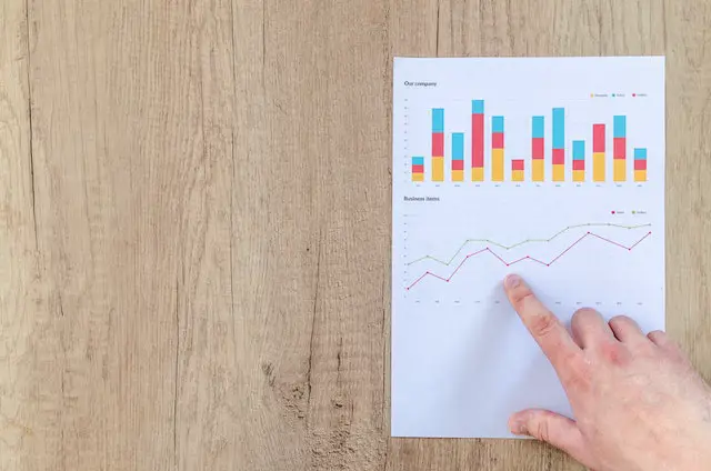
(Photo by Lukas at pexles.com)

Graphs typically show the relationship between two or more variables, while charts usually display the actual values of those variables. Graphs are also usually more flexible in terms of what information they can convey, while charts tend to be more specific. Finally, graphs are often better at showing trends over time, while charts can be better for comparing different data points side-by-side.
Another difference is that graphs usually display numerical data, while charts typically show categorical data. For example, a line graph would be used to track changes in numerical data over time, while a bar chart could be used to compare different categories of data.
The way that data is represented also differs between graphs and charts. Graphs often use lines or shapes to connect individual data points, while charts may use bars or columns to represent groups of data.
Ultimately, the choice of which type of graph or chart to use depends on the specific data set and the information you want to communicate.
When to use a graph or chart?
There are a few different factors to consider when trying to decide whether a graph or chart would be the best way to present your data. The first is the type of data you have. If your data is numerical, a graph might be the better option. If your data is categorical, a chart might be the better option. The second factor to consider is the level of detail you need to present. A graph can show more detailed information than a chart, so if you need to show something like trends over time, a graph would be the better choice. The third factor is what you want your audience to take away from the data. If you want them to be able to see relationships and patterns, a graph would be the better option. However, if you want your audience to be able to see comparisons between different categories, a chart would be the better option.
How to create a graph or chart?
There are a few things to keep in mind when creating a graph or chart. First, decide what type of data you want to visualize. This can be something as simple as tracking your daily steps or monitoring your weight loss over time. Once you have your data, you’ll need to choose a graph or chart that best represents that data. For example, if you’re tracking how much water you drink each day, a line graph would be a good choice. If you’re trying to show the percentage of people who prefer different flavors of ice cream, a pie chart would work well.
Once you’ve selected your graph or chart, it’s time to start inputting your data. If you’re using Excel, there are plenty of tutorials online that can help you get started. Simply Google “how to create a [line/bar/pie] graph in Excel” and you’ll find everything you need. If you’re not using Excel, there are still plenty of ways to create graphs and charts. There are many online tools that allow you to input your data and generate a graph or chart with just a few clicks.
Once your graph or chart is created, take some time to analyze your data and see what conclusions you can draw from it. What patterns do you see? Are there any outliers? What do the results tell you about your behavior? Use this information to help make better choices in the future and continue tracking your progress!
How can you create a chart?
There are a few things to consider when creating a chart:
-What type of data are you trying to display?
-Are you trying to compare data sets?
-What is the most effective way to organize your data?
Once you’ve considered these questions, you can begin creating your chart. There are a few different ways to create a chart in Excel:
-Select the data you want to include in your chart and click “Insert” > “Chart.”
-Click “Insert” > “Other Charts” and select the type of chart you want to create.
-Use the “Recommended Charts” feature to have Excel suggest the best type of chart for your data set.
What do you use a chart or graph for?
When you are looking at data, it is important to be able to visualize it in a way that makes sense. This is where charts and graphs come in handy. Both charts and graphs can be used to show relationships between pieces of data, but they are each used in different ways.
A graph shows how two or more variables are related to one another. In other words, it shows the relationship between cause and effect. For example, you could use a graph to show how the amount of time you spend studying affects your grades.
A chart, on the other hand, is used to compare different data sets side-by-side. For example, you could use a chart to compare the test scores of students in different grades.
Both charts and graphs can be helpful when you are trying to understand data. However, it is important to know when to use each one. Using the wrong type of chart or graph can make your data harder to understand instead of easier.
What are the most common types of graphs and charts?
The most common types of graphs and charts are Line graphs, Bar graphs, Pie charts, and Scatter plots.

(Photo by Isaac Smith on Unsplash)
Line graphs are used to track changes over time. They have a horizontal axis (X-axis) and a vertical axis (Y-axis). The X-axis is typically used for the independent variable, while the Y-axis is used for the dependent variable. Line graphs can be used to show trends, relationships, and comparisons.

(Photo by Giorgio Tomassetti on Unsplash)
Bar graphs are used to compare data between different groups. They have a horizontal axis (X-axis) and a vertical axis (Y-axis). The X-axis is typically used for the independent variable, while the Y-axis is used for the dependent variable. Bar graphs can be used to show trends, relationships, and comparisons.

(Photo by Firmbee.com on Unsplash)
Pie charts are used to represent data as a proportion of the whole. They have a circle with different sections that represent each category of data. Pie charts can be used to show trends, relationships, and comparisons.

(Photo by Tima Miroshnichenko at pexles.com)
Scatter plots are used to visualize relationships between two variables. They have a horizontal axis (X-axis) and a vertical axis (Y-axis). Both variables are plotted on the graph, and the relationship between them is shown by how close or far apart the points are. Scatter plots can be used to show trends, relationships, and comparisons
What are 5 things all graphs must have?
1. The title of the graph must be descriptive and give the reader an idea of what the data is representing.
2. The graph should have labeled axes that clearly state what units of measurement are being used.
3. The data points on the graph should be accurately plotted and easy to interpret.
4. The graph should have a legend to explain any symbols or colors being used.
5. The overall design of the graph should be visually appealing and easy to understand at a glance.
How to interpret graphs and charts?
To interpret graphs and charts, you need to understand the different types of data that can be represented and how to read the various elements of the graph or chart. For example, bar graphs and line graphs are common ways to represent data, with each bar or line representing a different data point. To interpret these graphs, you need to look at the labels on the axes and determine what the bars or lines represent. You also need to look at the scale of the graph or chart to understand how the data is distributed. For example, if a graph is scaled from 0 to 100, then a value of 50 would be halfway between the two extremes.
How do you present a graph?
When you present a graph, you are essentially giving your audience a visual representation of data. This can be data that you have collected yourself, or data that you have found from another source. Either way, it is important to present the data in a way that is easy for your audience to understand.
There are a few different ways that you can present a graph. The first is to simply give a static image of the graph. This can be done by taking a screenshot or by printing out the graph. If you choose to do this, make sure that the graph is clear and easy to read.
The second way to present a graph is to create an interactive version of the graph. This can be done using software like Excel or Google Sheets. Creating an interactive graph allows your audience to explore the data for themselves and see how it changes over time.
Finally, you can also embed a graph into a website or blog post. This is a great option if you want your audience to be able to view the data without having to leave your site. To do this, simply copy and paste the code for the graph into your post.
No matter which method you choose, presenting a graph is a great way to visualize data and help your audience understand it better.
Featured Image By Lukas Blazek on Unsplash


